- Published on
Raise Meets Inflation
- Authors

- Name
- Jack Burgess
- GitHub
- @jack828
Introducing: Raise Meets Inflation
I've been hard at work[citation needed] putting together another website that I couldn't quite find out there already.
I've always wondered how my salary progression through my career matches up to inflation. When you factor it in, it can make some jumps appear a little less than you expected.
I was concerned that one of those jumps would be not enough to cover inflation - an absolute certain sign to move on to another position - as it's a pay cut in real terms.
I can use sites like The Salary Calculator to see how my payrises compare to my previous salary - but again, this ignores inflation.
I can also use calculators like the ONS Salary Calculator, which is a great little widget, but has a couple issues with it.
First of all, it only looks at it as if I received the salary 12 months ago - not always the case - and secondly, doesn't show me a long term trend. Have I been chronically undercut, or barely scraping above inflation - so no real growth?
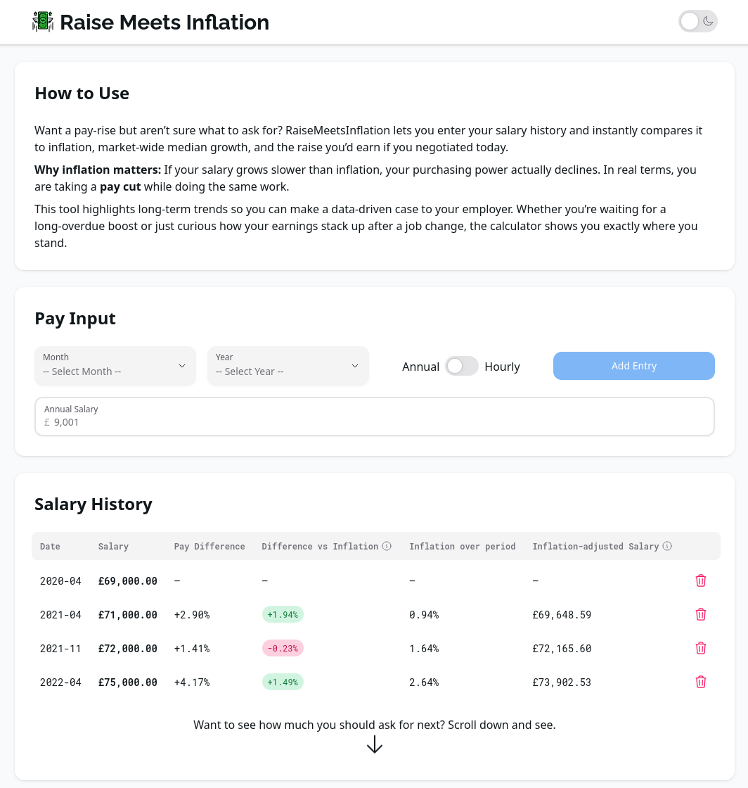
Data data data
If you put your salary history in and glance over the table you can get some juicy stats right off the bat:
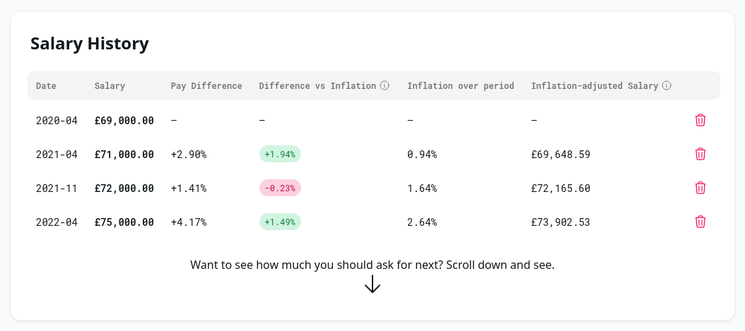
We can immediately see that our first increase was almost 2% better than inflation - not bad - and aside from the token mid-year bump which wasn't quite enough to match inflation it looks like we've done alright!
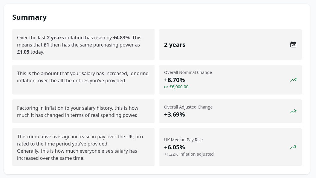
Moving onto the summary. We are shown how this compares overall - like if this was a review of your current employment progress, salary-wise.
We are shown how much percentage we've increased on the base amount, and how this compares to inflation and then how much the percentage is when adjusting for inflation - in this scenario we're confirmed to have done well, with 3.69% real term pay increase.
We're also shown something not many other sites include - how does this compare to everyone else, on average?
In our scenario's time period, everyone else got 1.22% real-term pay growth - less than half1 of what we have.
So that's great - we can rest easy knowing that our progression is on track to mean we earn more doing the same role. But what about second breakfast2 our next payrise?
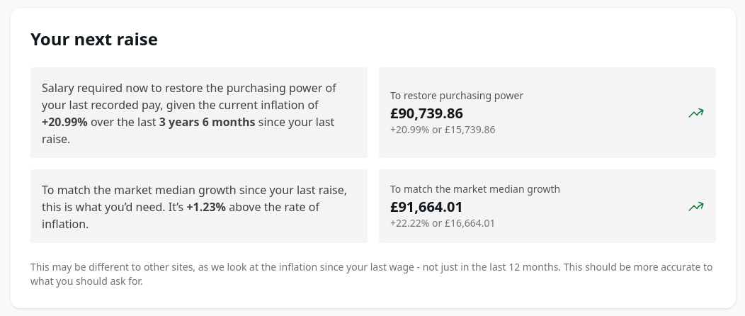
Don't forget that I put the last date as 2022-04, and the time of that screenshot is 2025-09 - so a considerable amount of time without a raise since then! If you're in that boat, leave!
Anyway - a normal situation this should be around the year mark and the numbers will be closer to what you currently earn. It factors in inflation and gives you a number - and as a bonus, what everyone else on average could be getting at the same time.
Technologies Used
As this is a programming blog, I've also got to expand on the tech used.
It's a NextJS 15 site, using the app router. I have to say that I am very impressed with this router over the pages router. It feels a lot more intuitive and well-thought-out. The special files are also very handy for generating the required metadata.
It's hosted on Cloudflare Pages. I get incredibly fast builds and deployments, with DDoS protection as standard, all wrapped up in a completely free package. I doubt (but do hope) that I'll ever exceed the free tier limits.
This NextJS on the edge is made possible by the @opennextjs/cloudflare package. It compiles the application (including API routes) into Workers, which makes it a breeze.
Some other bits worth mentioning:
- UI is made with Hero UI
See For Yourself
Now that you're interested, why don't you have a look at Raise Meets Inflation?
More features are planned and coming soon™!
Footnotes
Sorry. ↩